默认编辑器
此扩展点用于扩展默认编辑器的功能。
定义方式
export default definePlugin({
  extensionPoints: {
    "default:editor:extension:create": (): AnyExtension[] | Promise<AnyExtension[]> => {
      return [FooExtension];
    },
  },
});AnyExtension 类型来自 Tiptap,这意味着 Halo 默认编辑器的扩展点返回类型与 Tiptap 的扩展完全一致,Tiptap 的扩展文档可参考:https://tiptap.dev/docs/editor/api/extensions。此外,Halo 也为默认编辑器的扩展提供了一些独有的参数,用于实现工具栏、指令等扩展。
Halo 独有扩展
阅读此文当前请确保已经熟悉了 Tiptap 的扩展文档,这里将介绍如何对编辑器的功能进行扩展,包括但不限于扩展工具栏、悬浮工具栏、Slash Command、拖拽功能等。
目前支持的所有扩展类型如下所示:
export interface ExtensionOptions {
  // 顶部工具栏扩展
  getToolbarItems?: ({
    editor,
  }: {
    editor: Editor;
  }) => ToolbarItem | ToolbarItem[];

  // Slash Command 扩展
  getCommandMenuItems?: () => CommandMenuItem | CommandMenuItem[];

  // 悬浮菜单扩展
  getBubbleMenu?: ({ editor }: { editor: Editor }) => NodeBubbleMenu;

  // 工具箱扩展
  getToolboxItems?: ({
    editor,
  }: {
    editor: Editor;
  }) => ToolboxItem | ToolboxItem[];

  // 拖拽菜单扩展
  getDraggableMenuItems?: ({
    editor,
  }: {
    editor: Editor;
  }) => DragButtonType | DragButtonType[];
}
1. 顶部工具栏扩展
编辑器顶部功能区域内容的扩展,通常用于增加用户常用操作,例如文本加粗、变更颜色等。
在 https://github.com/halo-sigs/richtext-editor/pull/16 中,我们实现了对顶部工具栏的扩展,如果需要添加额外的功能,只需要在具体的 Tiptap Extension 中的 addOptions 中定义 getToolbarItems 函数即可,如:
{
  addOptions() {
    return {
      ...this.parent?.(),
      getToolbarItems({ editor }: { editor: Editor }) {
        return []
      },
    };
  },
}
其中 getToolbarItems 即为对顶部工具栏的扩展。其返回类型为:
// 顶部工具栏扩展
getToolbarItems?: ({
  editor,
}: {
  editor: Editor;
}) => ToolbarItem | ToolbarItem[];

// 工具栏
export interface ToolbarItem {
  priority: number;
  component: Component;
  props: {
    editor: Editor;
    isActive: boolean;
    disabled?: boolean;
    icon?: Component;
    title?: string;
    action?: () => void;
  };
  children?: ToolbarItem[];
}
如下为 Bold 扩展中对于 getToolbarItems 的扩展示例:
addOptions() {
  return {
    ...this.parent?.(),
    getToolbarItems({ editor }: { editor: Editor }) {
      return {
        priority: 40,
        component: markRaw(ToolbarItem),
        props: {
          editor,
          isActive: editor.isActive("bold"),
          icon: markRaw(MdiFormatBold),
          title: i18n.global.t("editor.common.bold"),
          action: () => editor.chain().focus().toggleBold().run(),
        },
      };
    },
  };
},
2. 工具箱扩展
编辑器工具箱区域的扩展,可用于增加编辑器附属操作,例如插入表格,插入第三方组件等功能。
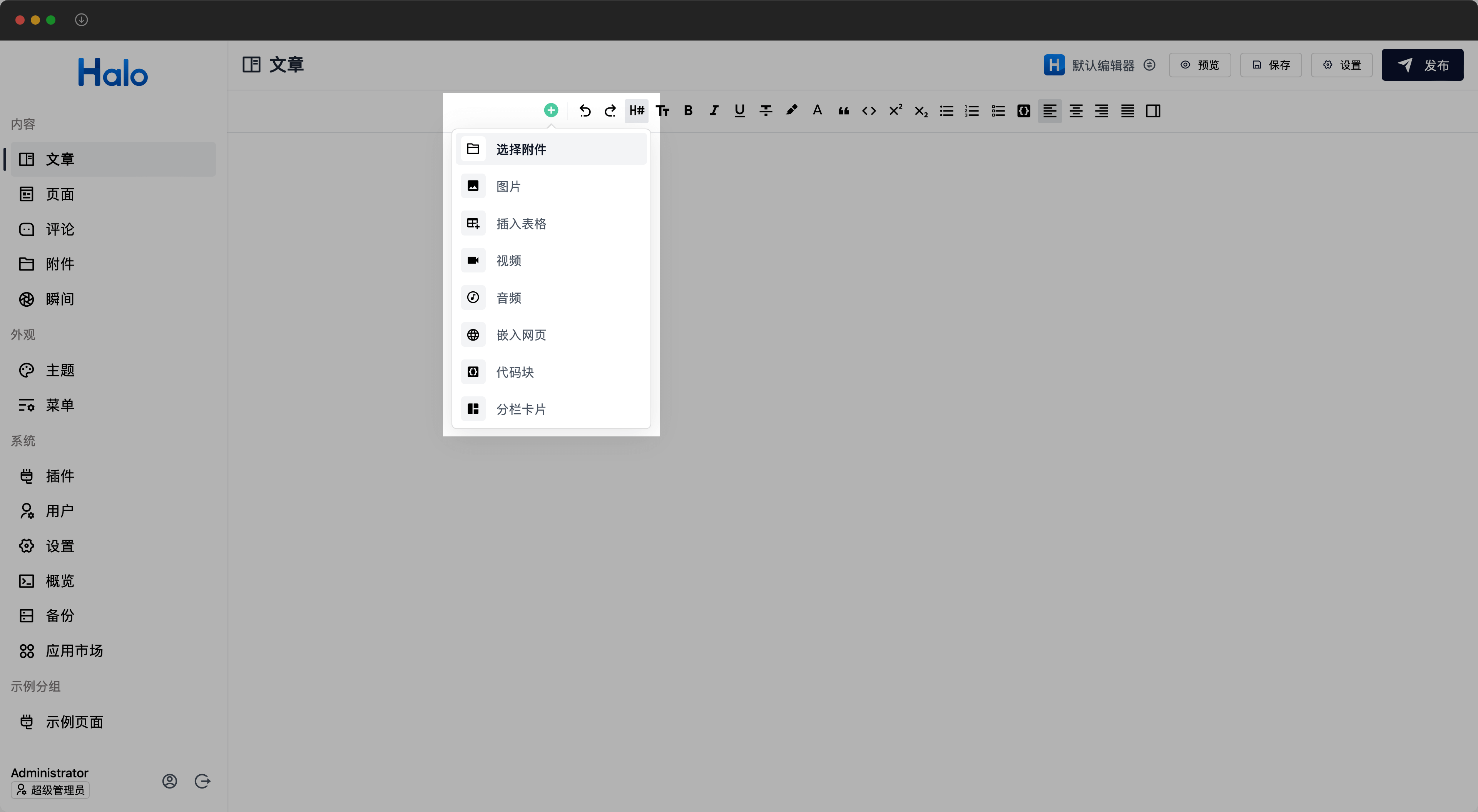
在 https://github.com/halo-sigs/richtext-editor/pull/27 中,我们实现了对编辑器工具箱区域的扩展,如果需要添加额外的功能,只需要在具体的 Tiptap Extension 中的 addOptions 中定义 getToolboxItems 函数即可,如:
{
  addOptions() {
    return {
      ...this.parent?.(),
      getToolboxItems({ editor }: { editor: Editor }) {
        return []
      },
    };
  },
}
其中 getToolboxItems 即为对工具箱的扩展。其返回类型为:
// 工具箱扩展
getToolboxItems?: ({
  editor,
}: {
  editor: Editor;
}) => ToolboxItem | ToolboxItem[];

export interface ToolboxItem {
  priority: number;
  component: Component;
  props: {
    editor: Editor;
    icon?: Component;
    title?: string;
    description?: string;
    action?: () => void;
  };
}
如下为 Table 扩展中对于 getToolboxItems 工具箱的扩展示例:
addOptions() {
return {
...this.parent?.(),
getToolboxItems({ editor }: { editor: Editor }) {
return {
priority: 15,
component: markRaw(ToolboxItem),
props: {
editor,
icon: markRaw(MdiTablePlus),
title: i18n.global.t("editor.menus.table.add"),
action: () =>
editor
.chain()
.focus()
.insertTable({ rows: 3, cols: 3, withHeaderRow: true })
.run(),
},
};
},
}
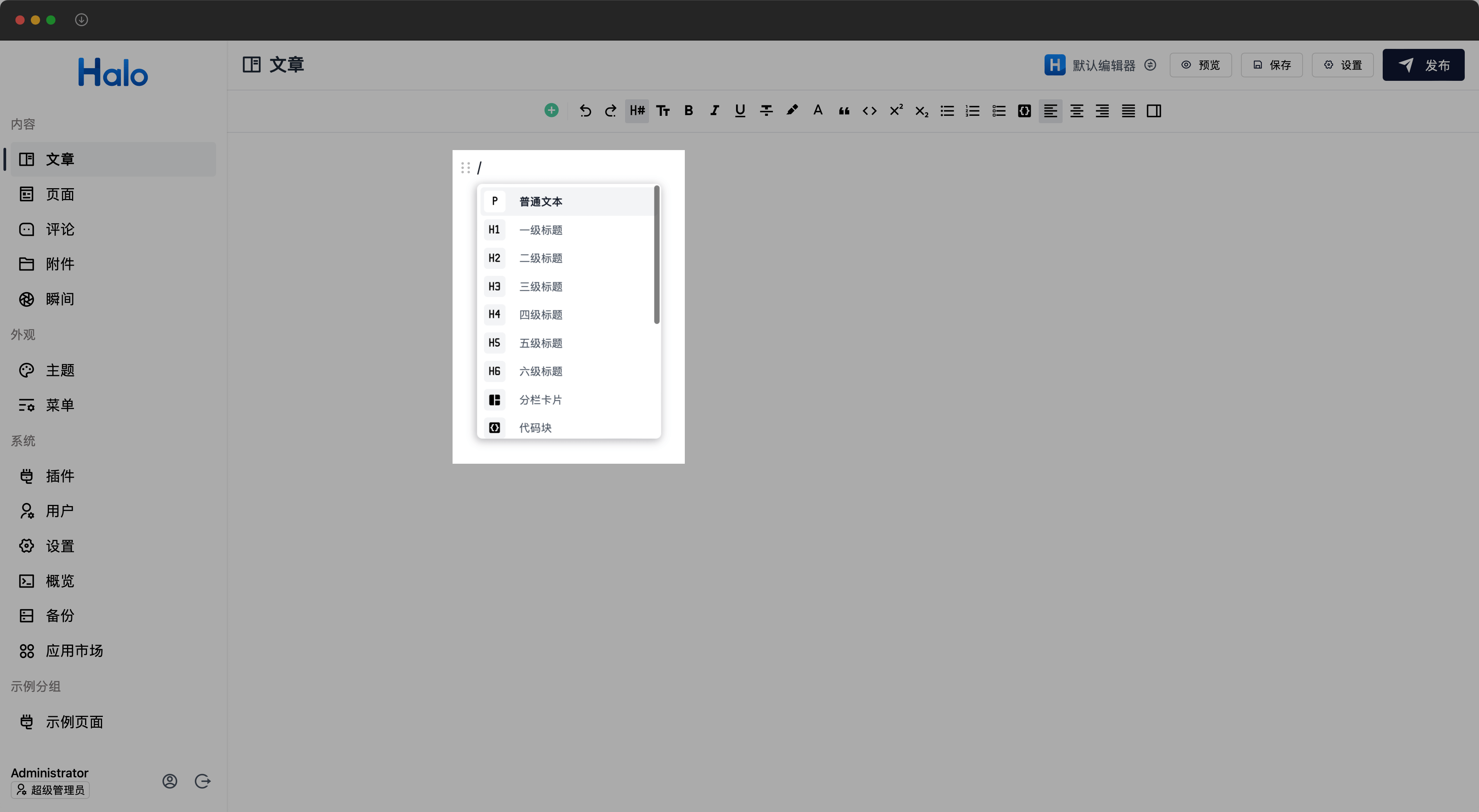
}3. Slash Command 扩展
Slash Command(斜杠命令)的扩展,可用于在当前行快捷执行功能操作,例如转换当前行为标题、在当前行添加代码块等功能。
在 https://github.com/halo-sigs/richtext-editor/pull/16 中,我们实现了对 Slash Command 指令的扩展,如果需要添加额外的功能,只需要在具体的 Tiptap Extension 中的 addOptions 中定义 getCommandMenuItems 函数即可,如:
{
  addOptions() {
    return {
      ...this.parent?.(),
      getCommandMenuItems() {
        return []
      },
    };
  },
}
其中 getCommandMenuItems 即为对工具箱的扩展。其返回类型为:
// Slash Command 扩展
getCommandMenuItems?: () => CommandMenuItem | CommandMenuItem[];

export interface CommandMenuItem {
  priority: number;
  icon: Component;
  title: string;
  keywords: string[];
  command: ({ editor, range }: { editor: Editor; range: Range }) => void;
}
如下为 Table 扩展中对于 getCommandMenuItems 的扩展示例:
addOptions() {
return {
...this.parent?.(),
getCommandMenuItems() {
return {
priority: 120,
icon: markRaw(MdiTable),
title: "editor.extensions.commands_menu.table",
keywords: ["table", "biaoge"],
command: ({ editor, range }: { editor: Editor; range: Range }) => {
editor
.chain()
.focus()
.deleteRange(range)
.insertTable({ rows: 3, cols: 3, withHeaderRow: true })
.run();
},
};
},
}
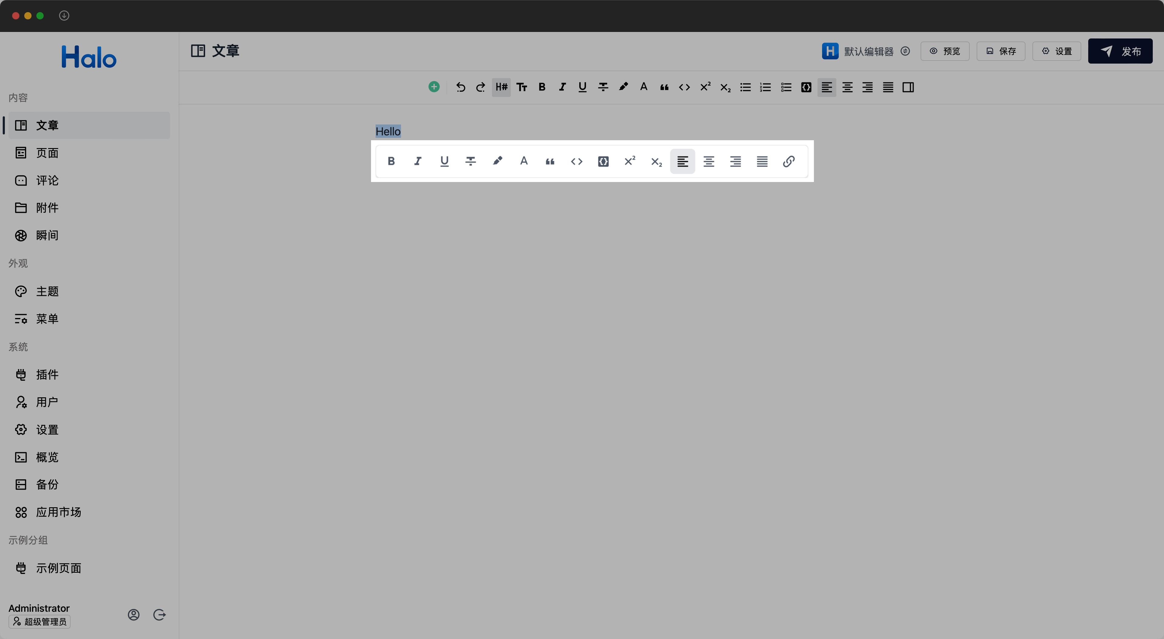
}4. 悬浮菜单扩展
编辑器悬浮菜单的扩展。可用于支持目标元素组件的功能扩展及操作简化。例如 Table 扩展中的添加下一列、添加上一列等操作。
在 https://github.com/halo-sigs/richtext-editor/pull/38 中,我们重构了对编辑器悬浮区域的扩展,如果需要对某个块进行支持,只需要在具体的 Tiptap Extension 中的 addOptions 中定义 getBubbleMenu 函数即可,如:
{
  addOptions() {
    return {
      ...this.parent?.(),
      getBubbleMenu({ editor }: { editor: Editor }) {
        return []
      },
    };
  },
}
其中 getBubbleMenu 即为对悬浮菜单的扩展。其返回类型为:
// 悬浮菜单扩展
getBubbleMenu?: ({ editor }: { editor: Editor }) => NodeBubbleMenu;

interface BubbleMenuProps {
  pluginKey?: string;                                             // 悬浮菜单插件 Key,建议命名方式 xxxBubbleMenu
  editor?: Editor;
  shouldShow: (props: {                                           // 悬浮菜单显示的条件
    editor: Editor;
    node?: HTMLElement;
    view?: EditorView;
    state?: EditorState;
    oldState?: EditorState;
    from?: number;
    to?: number;
  }) => boolean;
  tippyOptions?: Record\<string, unknown\>;                          // 可自由定制悬浮菜单所用的 tippy 组件的选项
  getRenderContainer?: (node: HTMLElement) => HTMLElement;         // 悬浮菜单所基准的 DOM
  defaultAnimation?: boolean;                                      // 是否启用默认动画。默认为 true
}

// 悬浮菜单
export interface NodeBubbleMenu extends BubbleMenuProps {
  component?: Component;                                           // 不使用默认的样式,与 items 二选一
  items?: BubbleItem[];                                            // 悬浮菜单子项,使用默认的形式进行,与 items 二选一
}

// 悬浮菜单子项
export interface BubbleItem {
  priority: number;                                                // 优先级,数字越小优先级越大,越靠前
  component?: Component;                                           // 完全自定义子项样式
  props: {
    isActive: ({ editor }: { editor: Editor }) => boolean;         // 当前功能是否已经处于活动状态
    visible?: ({ editor }: { editor: Editor }) => boolean;         // 是否显示当前子项
    icon?: Component;                                              // 图标
    iconStyle?: string;                                            // 图标自定义样式
    title?: string;                                                // 标题
    action?: ({ editor }: { editor: Editor }) => Component | void; // 点击子项后的操作,如果返回 Component,则会将其包含在下拉框中。
  };
}
如下为 Table 扩展中对于 getBubbleMenu 悬浮菜单的部分扩展示例:
addOptions() {
  return {
    ...this.parent?.(),
    getBubbleMenu({ editor }) {
      return {
        pluginKey: "tableBubbleMenu",
        shouldShow: ({ state }: { state: EditorState }): boolean => {
          return isActive(state, Table.name);
        },
        getRenderContainer(node) {
          let container = node;
          if (container.nodeName === "#text") {
            container = node.parentElement as HTMLElement;
          }
          while (
            container &&
            container.classList &&
            !container.classList.contains("tableWrapper")
          ) {
            container = container.parentElement as HTMLElement;
          }
          return container;
        },
        tippyOptions: {
          offset: [26, 0],
        },
        items: [
          {
            priority: 10,
            props: {
              icon: markRaw(MdiTableColumnPlusBefore),
              title: i18n.global.t("editor.menus.table.add_column_before"),
              action: () => editor.chain().focus().addColumnBefore().run(),
            },
          },
        ]
      }
    }
  }
}
5. 拖拽菜单扩展
拖拽菜单扩展主要用于拖拽的菜单功能扩展,例如转换为、复制、剪切、删除等操作。
在 https://github.com/halo-dev/halo/pull/7861 中,我们重构了对编辑器拖拽区域的扩展,并且支持了对拖拽菜单的扩展。如果需要对拖拽菜单进行扩展,只需要在具体的 Tiptap Extension 中的 addOptions 中定义 getDraggableMenuItems 函数即可,如:
{
  addOptions() {
    return {
      ...this.parent?.(),
      getDraggableMenuItems({ editor }: { editor: Editor }) {
        return []
      },
    };
  },
}
同时,为了支持不同扩展对同一菜单项的扩展,我们提供了 extendsKey 属性,用于指定扩展目标菜单项的唯一标识。只需将 extendsKey 设置为已有的菜单项的 key,即可扩展该菜单项。可扩展已有菜单项的 visible、isActive、disabled、action 方法以及 children.items 属性,如:
{
  addOptions() {
    return {
      ...this.parent?.(),
      getDraggableMenuItems({ editor }: { editor: Editor }) {
        return {
          extendsKey: CONVERT_TO_KEY,
          // 当任意扩展目标菜单项的 visible 方法返回 false 时,当前菜单项不会显示。返回 true 则会继续执行后续的扩展实现。
          visible: ({ editor }) => {
            if (isActive(editor.state, "table")) {
              return false;
            }
            return true;
          },
        };
      },
    };
  },
};
拖拽菜单最多支持两级菜单嵌套,如果想扩展已有的一级菜单,为其二级菜单增加内容,则需要同时设置 extendsKey 和 children.items 属性。如:
{
  addOptions() {
    return {
      ...this.parent?.(),
      getDraggableMenuItems({ editor }: { editor: Editor }) {
        return {
          extendsKey: CONVERT_TO_KEY,
          children: {
            items: [
              {
                priority: 10,
                icon: markRaw(MdiFormatParagraph),
                title: i18n.global.t("editor.common.heading.paragraph"),
                action: ({ editor }: { editor: Editor }) =>
                  editor.chain().focus().setParagraph().run(),
              },
            ],
          },
        }
      },
    };
  },
}
默认情况下,将会追加 items,若想覆盖,则需要设置子菜单的 key 属性,将会覆盖原有的子菜单项。
下面为 getDraggableMenuItems 的返回类型:
// 拖拽菜单扩展
getDraggableMenuItems?: ({
    editor,
  }: {
    editor: Editor;
  }) => DragButtonType | DragButtonType[];

// 拖拽菜单项目属性
export interface DragButtonItemProps {
  extendsKey?: string;                                    // 扩展目标菜单项的唯一标识,如果提供了该属性,则视为扩展目标菜单项。
  key?: string;                                           // 唯一标识,如果同级菜单项设置了同样的 key,则会被合并为一个菜单项。
  priority?: number;                                      // 优先级,数字越小优先级越大,越靠前
  title?: string | (() => string);                        // 标题
  icon?: Component;                                       // 图标
  action?: ({                                             // 点击菜单后的操作,如果返回 Component,则会将其包含在子菜单中。
                                                          // 可以通过调用 close 方法可以在操作完成后关闭拖拽菜单,或者当返回为 true 或 undefined 时,会自动关闭拖拽菜单,如果返回 false,则不会关闭拖拽菜单。
                                                          // 多个扩展实现时,则按照顺序执行,并在返回非 undefined 值时停止执行。
    editor,
    node,
    pos,
    close,
  }: {
    editor: Editor;
    node: PMNode | null;
    pos: number;
    close: () => void;
  }) => Component | boolean | void | Promise<Component | boolean | void>;
  iconStyle?: string;                                       // 图标自定义样式
  class?: string;                                           // 自定义样式
  visible?: ({                                              // 是否显示当前菜单项,默认为 true,多个扩展实现时,以 AND 逻辑判断,即所有扩展返回 true 时,当前菜单项才会显示。
    editor,
    node,
    pos,
  }: {
    editor: Editor;
    node: PMNode | null;
    pos: number;
  }) => boolean;
  isActive?: ({                                             // 当前菜单项是否处于活动状态,默认为 false,多个扩展实现时,以 OR 逻辑判断,即只要有一个扩展返回 true,则当前菜单项处于活动状态。
    editor,
    node,
    pos,
  }: {
    editor: Editor;
    node: PMNode | null;
    pos: number;
  }) => boolean;
  disabled?: ({                                                // 是否禁用当前菜单项,默认为 false,多个扩展实现时,以 OR 逻辑判断,即只要有一个扩展返回 true,则当前菜单项会被禁用。
    editor,
    node,
    pos,
  }: {
    editor: Editor;
    node: PMNode | null;
    pos: number;
  }) => boolean;
  keyboard?: string;                                            // 快捷键,遵循 https://tiptap.dev/docs/editor/core-concepts/keyboard-shortcuts
  component?: Component;                                        // 自定义组件,如果提供了该属性,则不会显示默认的菜单项,而是会显示自定义组件,并且将所有 props 传递给自定义组件。
  [key: string]: any;                                           // 其他自定义属性,将会传递给自定义组件。
}

// 一级菜单项
export interface DragButtonType extends DragButtonItemProps {
  children?: {                                                    // 子菜单项,如果提供了该属性,则视为扩展目标菜单项的二级菜单。
    component?: Component;                                        // 自定义组件,如果提供了该属性,则不会显示默认的子菜单项,而是会显示自定义组件,并且将所有 props 传递给自定义组件。
    items?: DragButtonItemProps[];                                // 子菜单项列表,如果提供了该属性,则视为扩展目标菜单项的二级菜单。
  };
}